BRI: Improved Filter System Design for QCash
QCash, a BRI platform where corporate clients manage enormous volumes of transactions through filters.
Client
BRI - QCash Management
Year
2024
Services
Dashboard
Finance & Banking
I’ll go through step-by-step details on the system design remake for QCash, a BRI platform where corporate clients manage enormous volumes of transactions through filters. This included addressing the pain points of users, improving the overall efficiency of the platform, and making sure the new system would be able to support complex filtering needs with a wide range of different datasets. By putting a strong focus on user-centered design, iterative testing, and direct user feedback, we came up with a solution that provided extensive enhancement in terms of both usability and productivity
Research and Problem Identification
QCash is an important platform that will enable corporate clients to handle basic financial transactions, such as mass payments, account management, and report generation. Based on initial user feedback, Version 2 of the existing filter system had a lot of shortcomings in handling large data for its users. We initiated the redesign process by first carrying out detailed user research to understand their needs and challenges.
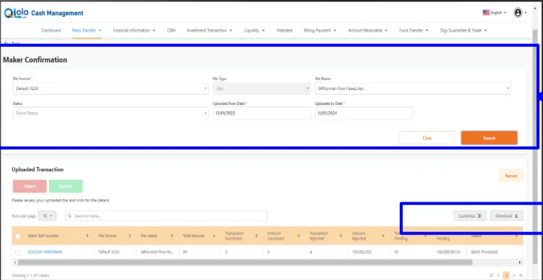
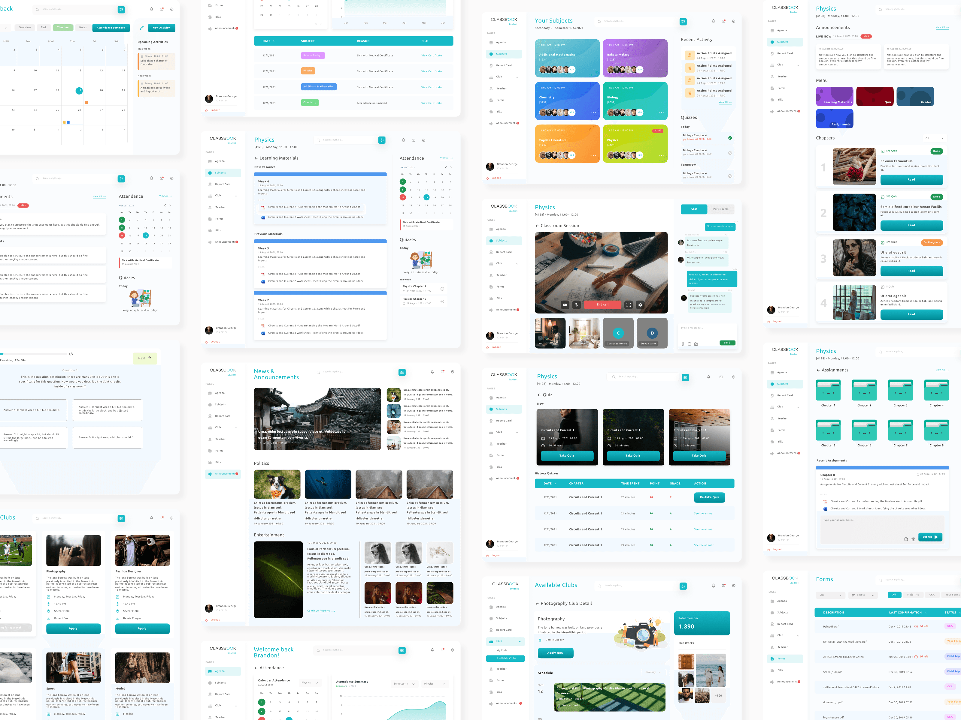
Older version of Filter System on QCash platform, Version 2. The ‘Maker Confirmation’ section includes a few input fields, such as File Format, File Type, and Status, which are to be typed manually. The ‘Uploaded Transaction’ table shows the result of the uploaded file and gives an option to download or print the filtered data.
Design Process: Creating Version 1 of Filter System
I then proceeded to create wireframes and mockups in Figma to solve the pain points of these users. The main task was an easy and intuitive filtering system that could minimize cognitive load for users and increase their experience.

Key Design Features of Version 1:
One-Click Filters:
Users can apply common filters with a single click. Options like “All,” “File in Process,” “On Process,” and “File Processed” enable the user to filter data immediately without having to input search criteria in each column manually.Pre-set Filters for Common Tasks:
Particular user needs were involved in giving a pre-set filter for immediate access to the most common data the user would want; for example, the status of a file. The user can filter the transactions based on a status choice like “Pending”, “Completed,” or “Failed” without configuring filters themselves.Advanced Filtering Options:
While Version 1 did allow the user to choose, where necessary, multiple filter criteria simultaneously-a date range, status, and type of transaction-filter all at once. In so doing, it provided flexibility for corporate users who faced numerous transaction records.Simple user interface:
Thanks to the clear categories of filtering, which could be expanded or collapsed at any time with a mere click, the design prevented clutter from building up in the layout. This kept the interface simple yet truly workable for advanced tasks in case such were needed.Cross-Platform Compatibility:
The filtering system was responsive to allow for smooth compatibility between desktop and mobile. This was especially helpful to the end-user in the field jobs that required access to QCash while on the move.
Usability Testing: Validating the Design with Real Users
Usability testing was next, after refinement of the initial prototype to validate the new filter system’s effectiveness, Version 1. Testing participants were corporate users of QCash on a regular basis. Test participants were asked to perform certain tasks with both the new system, Version 2, and the old system.

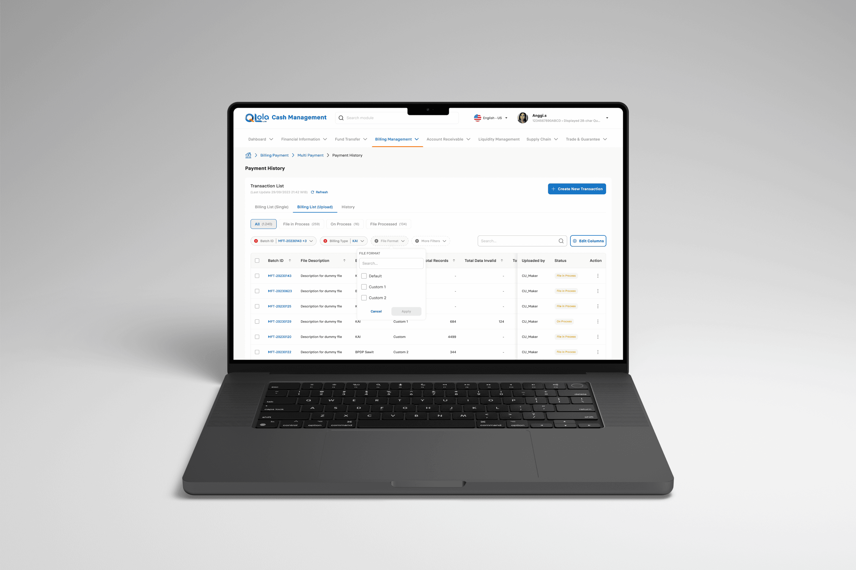
Filter system, Version 1 vs. Version 2: This would enable the user to apply filters and display all data simultaneously, status tracking; whereas in Version 2, the user has to insert data manually in each filter column.
Usability Test Results
The testing phase produced some helpful findings that contributed to the refinement of Version 1.

Time Efficiency:
The average time to complete a given filtering task in Version 2 was 35.6 seconds.
In Version 1, the average duration reduced drastically to 4.9 seconds, entailing an efficiency improvement of 86.2% in terms of time.
One-click filters and the provision for pre-set options were especially helpful in reducing the number of steps required to get the data out.
Smaller numbers of mistakes:
In Version 2, the misclicks in filtering were made by all users, at 100%, which is really indicative of the complexity of the old system.
In Version 1, the error rate drastically decreased to only 11%, therefore reflecting that the new system was much more usable.
The basis of the low error rate encountered in Version 1 was a simplification of the interface and the intuitiveness of the options, which easily allowed users to select only the correct filters with less confusion.
Positive User Feedback:
Pre-set Filters:
They said that pre-set filters do not require them to take more steps; instead, it saves them time. One even exclaimed, “I needn’t re-enter the same criteria each and every time I need recent transactions-it is all there in one click.”Simplified Workflow:
Most of them found it much easier to work around in this new system, especially for common tasks such as filter by status or recent transactions.Export Capabilities:
All test participants liked the capability to download and print filtered results directly from the UI. As a matter of fact, this functionality proved imperative when reporting on behalf of audits or even sending information to colleagues.
Room for Improvement:
While general feedback was positive, there were a few requests from some users to add an additional layer to pre-set filters, like having users save their own filters.
Other works