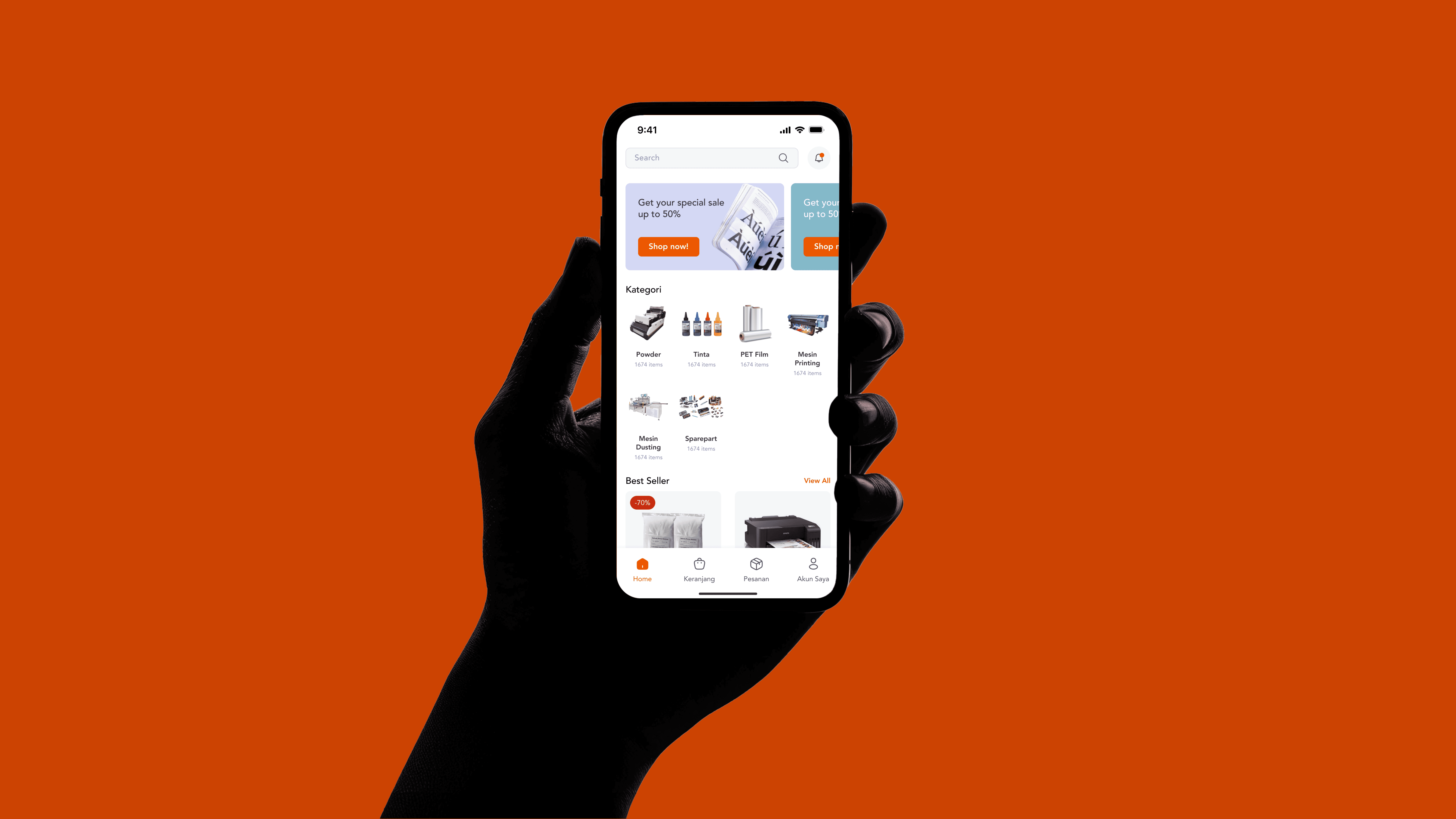
Kobelco: IoT Dashboard for Kobelco Compressors
Kobelco required a centralized system where users could monitor their equipment in real-time, manage maintenance schedules, and track performance metrics across multiple locations.
Client
Kobelco
Year
2024
Services
Web Design
Dashboard
Technology
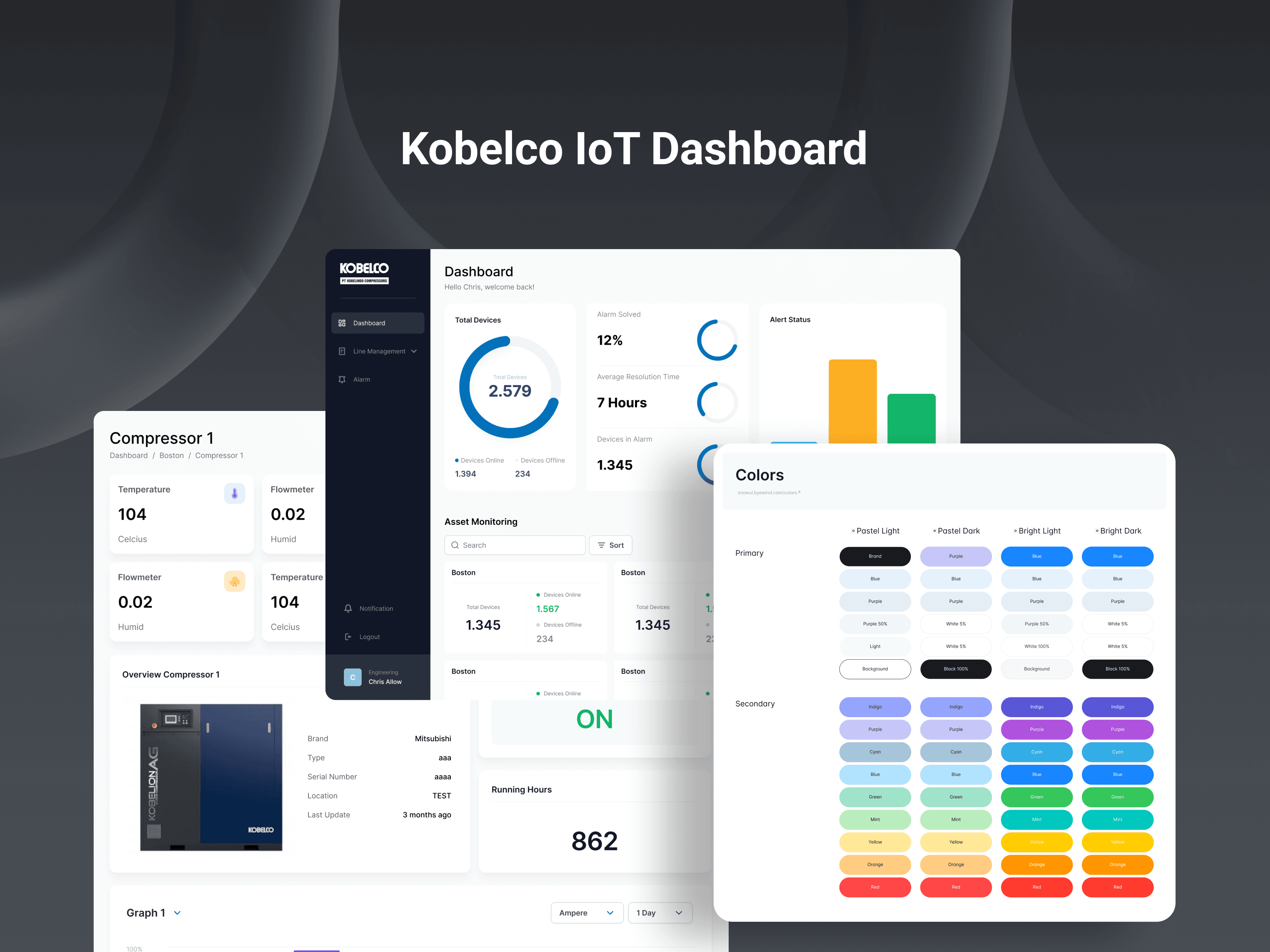
As a UI/UX designer, this was the requirement to transform the technical requirement into an intuitive and effective IoT dashboard for monitoring and managing heavy machinery on Kobelco Compressors. I needed to make the interface user-friendly, visually clean, and in a way that it could manage all the complex functionalities that went into monitoring and managing heavy machinery. I worked very closely with both developers and engineers, focusing on how to make the complex data simple and deliver seamless experiences.
Problem Statement
Kobelco required a centralized platform from where the users would be able to see in real time the conditions of their equipment, schedule maintenance, and track the key performance indicators from any location. This was going to present the challenge of developing a design that visually could represent a lot of information without the user becoming overwhelmed. It fell upon me to ensure that the interface would be able to support both technical and nontechnical users in easily navigating and working with the data.
Design Process
1. Understanding User Needs
Insight into the design process at Kobelco came right from the start with its team: equipment operators, maintenance staff, and managers. I focused on their pain points, understanding workflows, and what information was crucial for quick access. This helped to shape the initial design, especially for a clean layout and accessible data.
2. Wireframing & Prototyping
I started off by creating low-fidelity wireframes, which gave the basic structure for the dashboard on where primary navigation would go, how users would switch between devices, and how real-time data and alerts would appear. Informed by feedback from the team, I moved into high-fidelity prototypes using Figma to give a more advanced visual representation of the final product.
3. Visual Design and User Experience
The visual design of this dashboard needed to reflect the branding at Kobelco-functionally modern. I used a minimalist color scheme, saving high-contrast highlights for critical alerts and statuses to draw attention. The design emphasized clarity through easy-to-read typography and was structured to let users quickly assess the health of their equipment.
Other works